Vibrancy, Identity, and Nature – Interior Colors at the Vanport Building
Emily Wright
March 22, 2022The Vanport Building wouldn’t be a reality without the collaboration between the PSU Graduate School of Education, the OHSU|PSU School of Public Health, the PCC Dental Program, and the City of Portland Bureau of Planning and Sustainability. I’m proud of my role in this collaborative process and how the design reflects a unique approach to creating a multi-disciplinary community focused on public health.
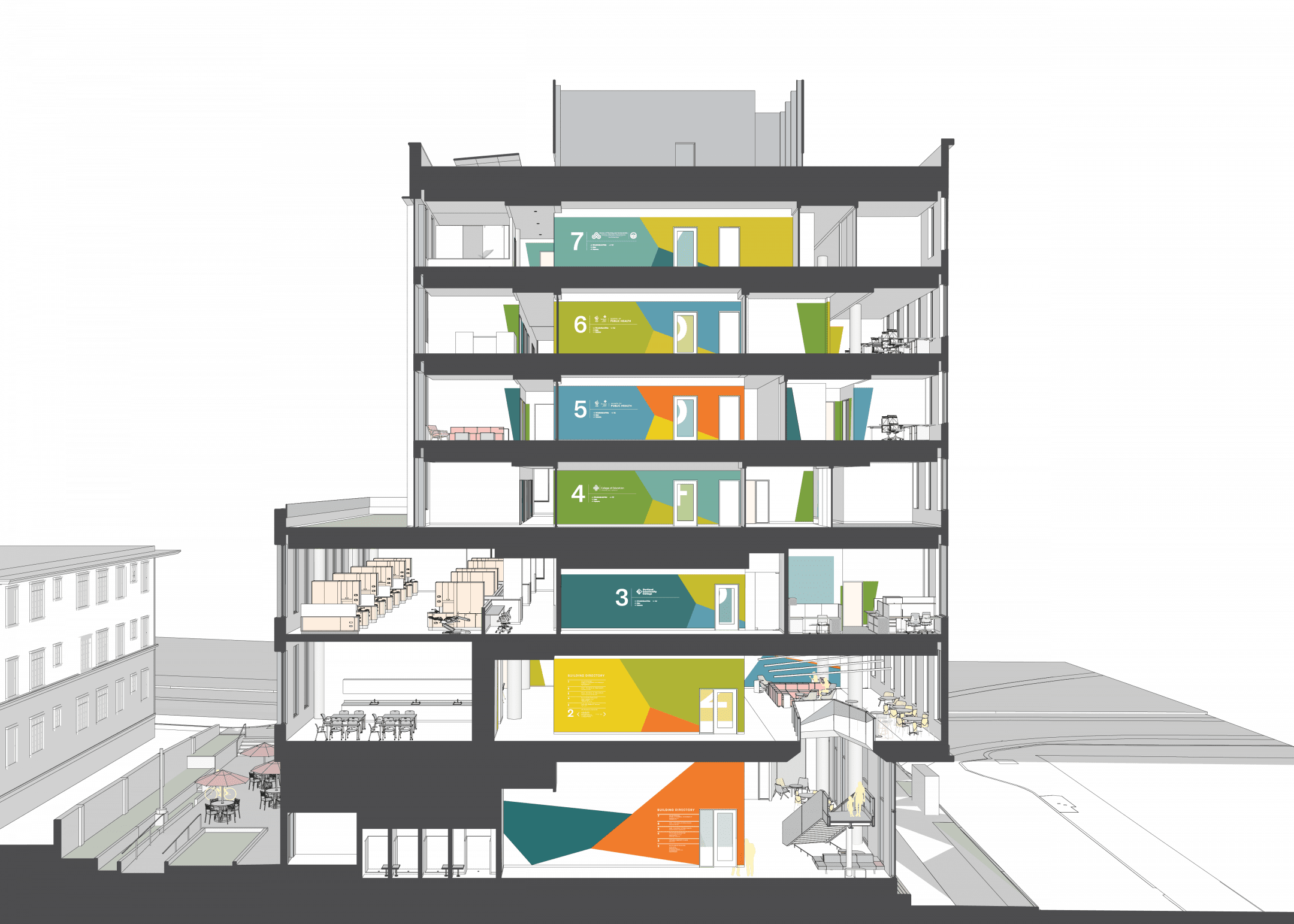
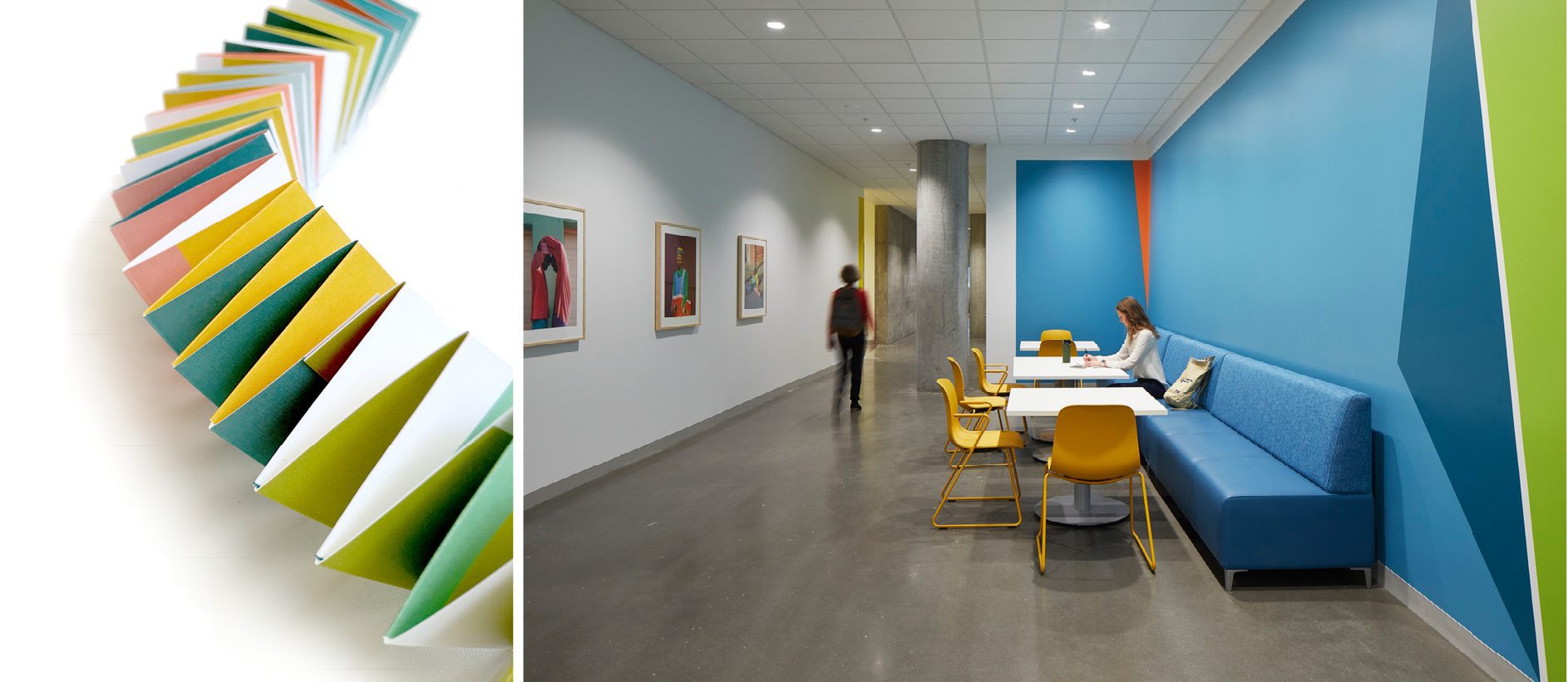
The interior design of the Vanport Building supports the individual identity of each group while celebrating the spirit of community that made the project a reality. Colors selected for the interior highlight the identity of each group and infuse cohesion throughout the building. School and branding colors provided an intuitive starting point and a way to celebrate each institution’s unique culture and character. The Pacific Northwest also inspired our palette: the lush greens from Deschutes National Forest, deep blues from Cannon Beach, and the pinks and yellows of a sunrise over Mount Hood.
Using paint and fabric selections intentionally and creatively was a way we could elevate the interior’s beauty and dynamism while being sensitive to the reality of budgets. Saturated hues we could mix and match throughout the building would provide maximum impact.
The result of this work is a palette of eleven colors that form multiple smaller palettes, so each floor has four colors with two colors occurring on the floor above or below. As an individual moves through the building there is a continuous thread connecting each floor, while recognizing the unique identity of each occupant.
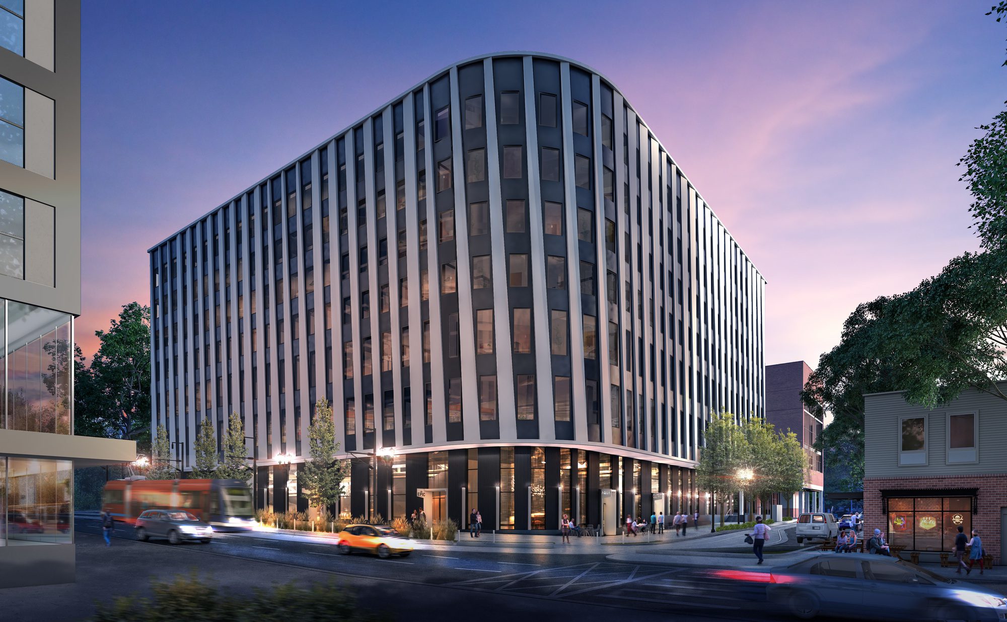
How we applied the color was also an important consideration, and we wanted the interior design to respond to the exterior concepts. The angular application of paint on interior walls supports the sense of movement from the sculptural metal panels on the façade. The dynamic application plays with perspective as people move throughout the space. Color changes in corridors break down long stretches and indicate direction to support wayfinding. It’s also a delight to explore the space; after taking just a few steps, someone can have a completely different perception of color and ambience.
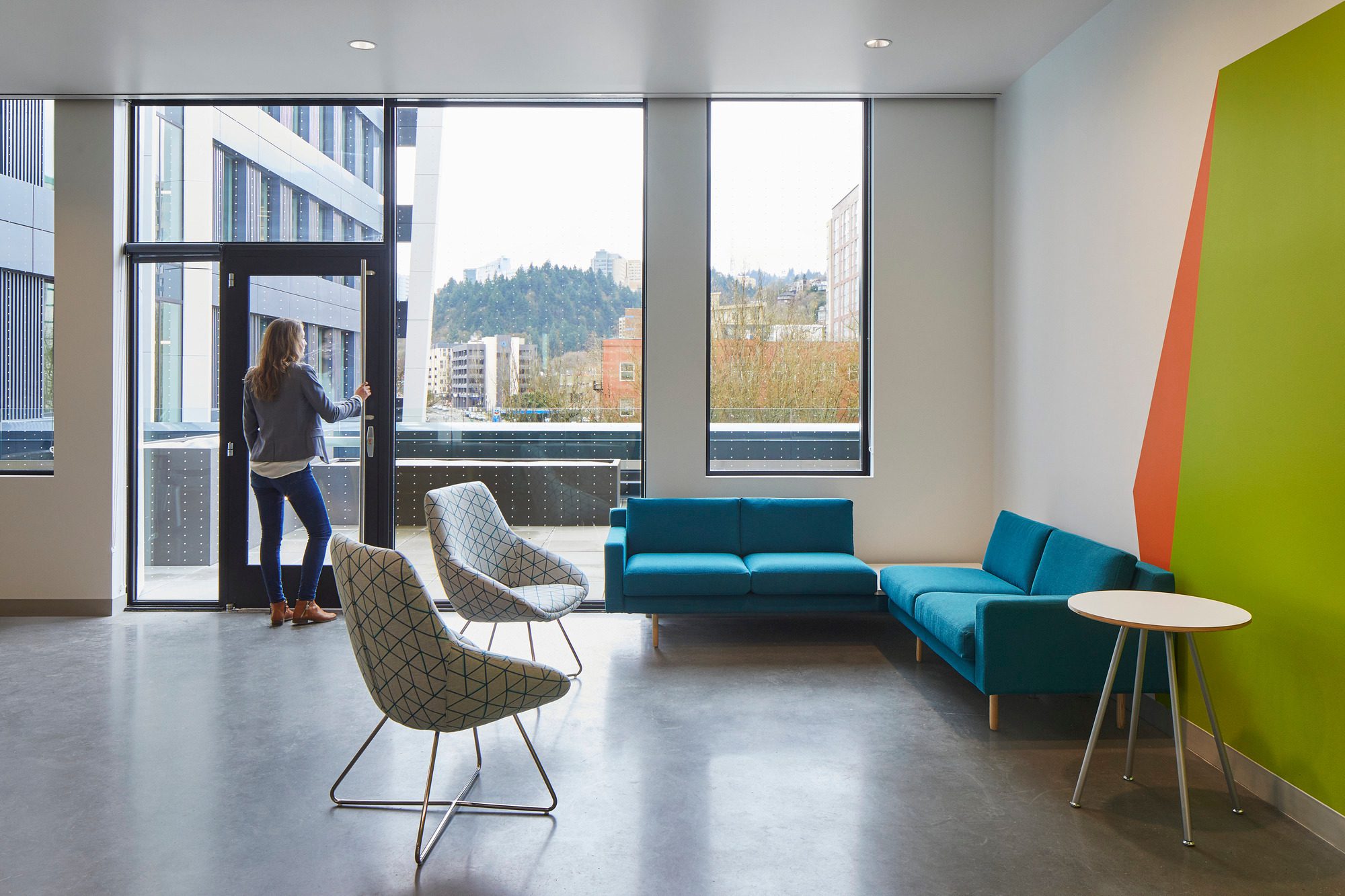
Great care was given to the location of program spaces within the building in order to maximize opportunities for views and daylight for the most people. Despite the large variation in program types between the four owners and seven floors, the design team created a template of the most common spaces between the four groups and located these spaces similarly floor to floor. One example is the reception areas for floors 4-7, which occur on the perimeter of the building where the design team was able to create large, floor to ceiling windows that take advantage of the unobstructed views west. We also repeated break rooms and lounges in the radius northwest corner on each floor. Open offices and shared resources, such as conference rooms, took priority along exterior walls, which moved private offices and enclosed support spaces inboard. This also allowed ceiling heights in the perimeter spaces to be maintained with the head of the windows.
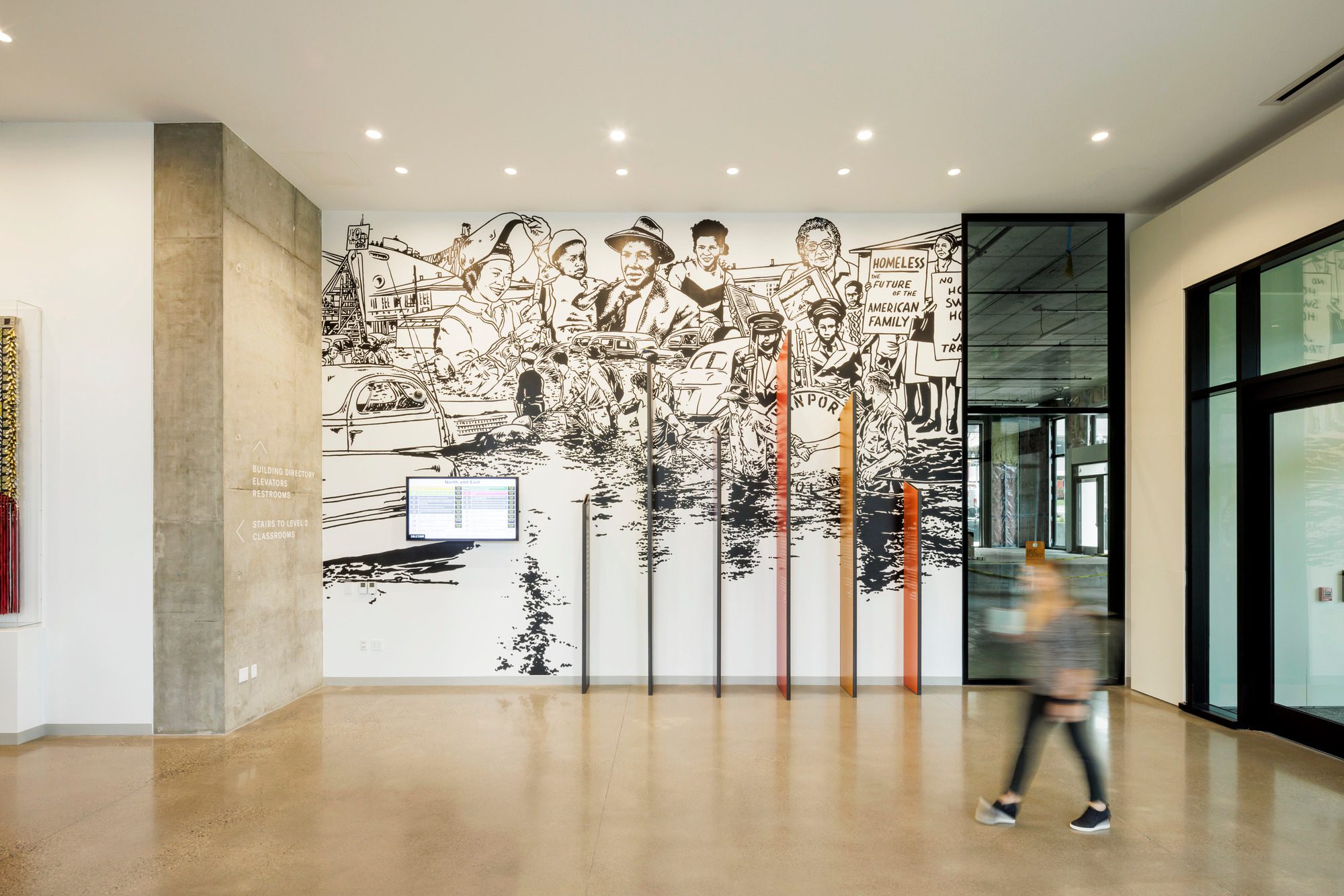
The interiors of the Vanport Building also celebrate the connection to the broader community. This is especially apparent in the unique collection of public art. Ella Ray, writer, curator and PSU alumna, wrote a great introduction to the featured art, and you can learn more about the collection here.
“The collection of contemporary art selected for the Vanport Building, a collaboratively owned learning and public health space, was curated to invite regular building-users and passersby into conversations with the work. Beyond ambitions to highlight aesthetic connections and tensions between artists, the selection committee purposefully curated this group of artists as a reflection of Portland’s communities.” – Ella Ray
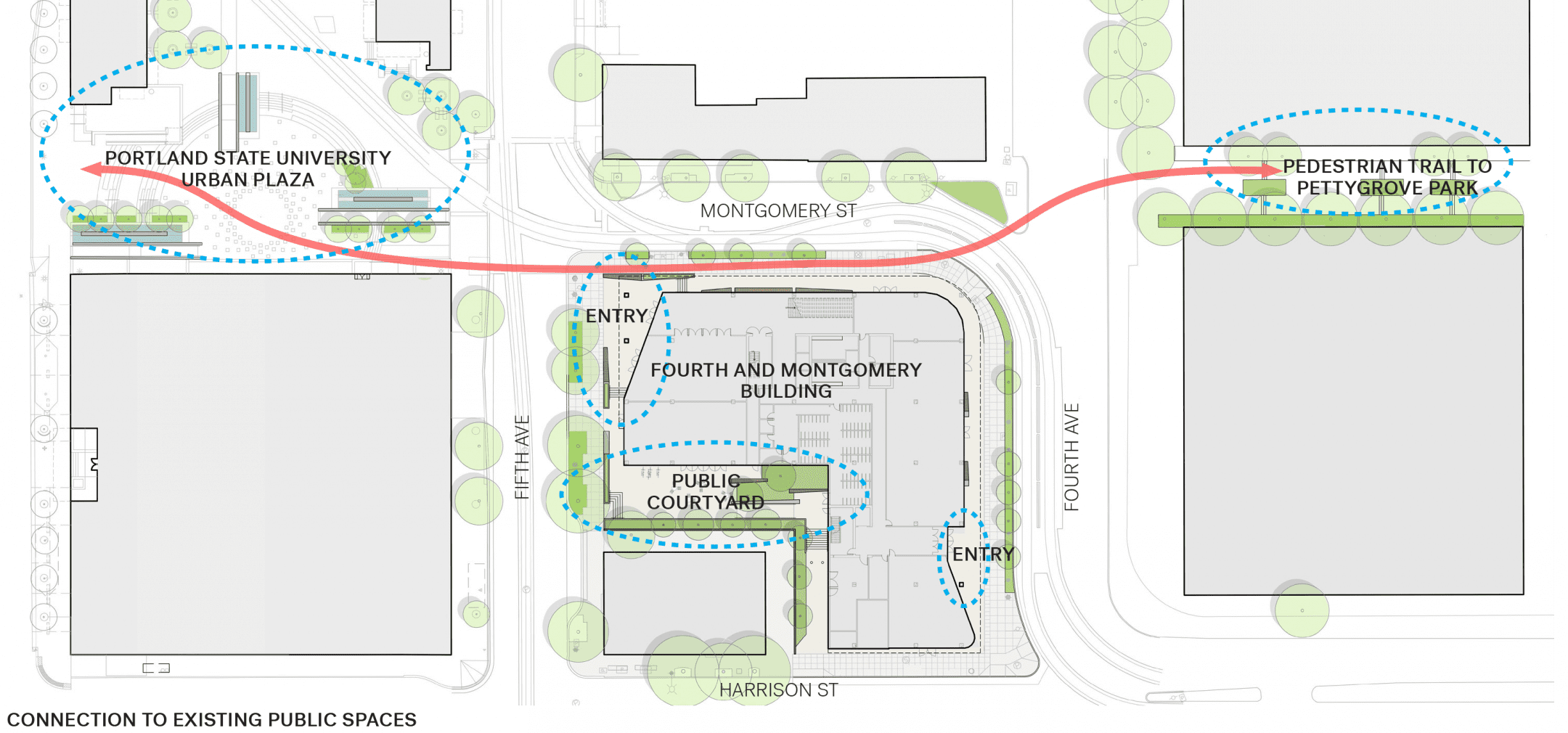
The Vanport Building occupies an active and dense part of the city and encourages public participation inside and out. Generous, covered sidewalks connect pedestrians to the public courtyard, public transit lines, and retail space. It also reinforces connection throughout the neighborhood.
The design of the building and the collaboration of passionate stakeholders make this a vital resource for public health and engagement. The Vanport Building reflects the natural beauty of the northwest, the distinctive spirit of Portland, and the vibrant community it serves.

